Radar Chartを描く(plotrix) その1
Radar Chartを描く方法をいくつか試したので、備忘録的に書いておく。
今回は,plotrixを使用した。
データとしては、個人的にエクセルでもらうことの多い、以下のような形式。ファイル名は取り合えず、test.csvとしておく。
| ID | Section1 | Section2 | Section3 | Section4 |
| 1 | 40 | 30 | 50 | 79 |
| 2 | 72 | 65 | 24 | 77 |
| 3 | 24 | 15 | 10 | 31 |
| … | … | … | … | … |
| 30 | 26 | 14 | 97 | 53 |
library(dplyr)
library(plotrix)
dat=read.csv("test.csv")
dat$ID=as.factor(dat$ID) #IDはfactorに変換
dat2=dat %>% summarize_if(is.numeric, funs(mean)) #dplyrのsummarizeで、numericの列だけ平均を出す。
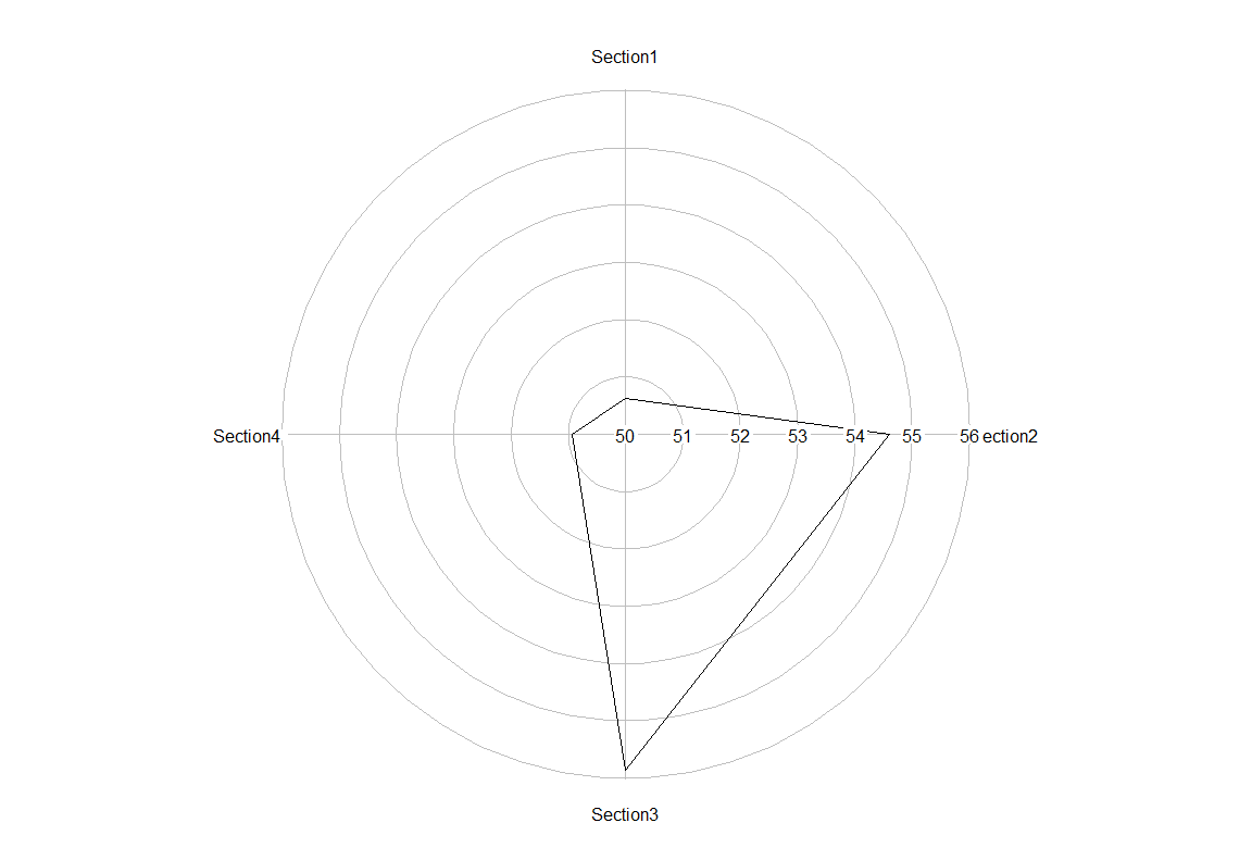
radial.plot(dat2, #データの入力
rp.type="p", #表示方法。オプションは、r (中心から直線が出る),p (線で結ぶ),s (点のみ)
start = pi/2, #グラフを始める位置。Section1を12時にする。
radial.lim = c(50,56), #軸の範囲。
labels = colnames(dat2), #項目名
clockwise = TRUE #時計回りに表示
)