Radar Chartを描く(plotrix) その2
備忘録その2。よくもらうデータのタイプとしては,以下のようなものもある。
| ID | Section1_2016 | … | Section4_2016 | … | Section4_2017 |
| 1 | 49 | … | 71 | … | 8 |
| 2 | 98 | … | 28 | … | 5 |
| 3 | 55 | … | 51 | … | 30 |
| 4 | 91 | … | 2 | … | 47 |
| 5 | 60 | … | 20 | … | 56 |
| … | … | … | … | … | … |
| 30 | 90 | … | 17 | … | 44 |
library(dplyr)
library(tidyverse)
library(plotrix)
dat=read.csv("test2.csv") #データ読み込み
dat2 = dat %>% #datを対象とした以下の処理をして,それをdat2へ入れる
gather(Section_Year,Score, -ID) %>% #縦長のデータにする。Section_Yearという新しい変数を作り,SectionX_20xxデータを並べる。Scoreはの横に配置。IDは入れない。
separate(col="Section_Year", sep="_", into=c("Section", "Year"))%>% #Section_Yearを_を区切りに分けて,SectionとYearを別々の列とする
group_by(Section,Year) %>% #SectionとYearでグループ化する
summarize(mean=mean(Score)) %>% #Scoreの平均を出す
spread(Section, mean) #横向きデータに変更
dat3 = select_if(dat2, is.numeric) #数値しか入れられないので,数値以外は削除。
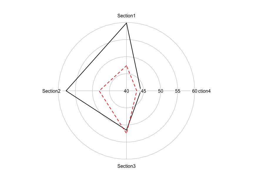
radial.plot(dat3, #データ入力
rp.type = "p", #表示方法。オプションは、r (中心から直線が出る),p (線で結ぶ),s (点のみ)
start = pi/2, #グラフを始める位置。Section1を12時にする。
radial.lim=c(40,60), #軸の範囲。
labels=colnames(dat3), #項目名
line.col=1:2, #線の色。ここでは1(黒)と2(赤)。
lwd=2, #線の太さ。
lty=1:2 #線の種類。ここでは1(実線)と2(点線)。
)
うーん、もっとスマートな整形の仕方はないものか。